Tuesday, March 29, 2011

1960s Pepsi Ad

      This Pepsi advertisement uses trendiness of the time period to make portray the message that in order to be sociable and cool, you should drink Pepsi. The two main people in the foreground holding Pepsis are being looked at and admired by the people in the background. Their sizes are proportionate with their importance in the ad as well as their proposed social status. Majority of the ad contains neutral, dull colors to emphasize the red and blue colors of the awning and the woman's dress, which are the colors of the Pepsi company.

Saturday, March 5, 2011

1940s Rice Krispies Ad

This advertisement was one of the earliest ads that promoted the recipe for Rice Krispies treats. The ad featured hand-drawn illustrations of two happy children (one of each gender was as politically correct as it got during that time.) There are also the cereal's mascots (Snap, Krackle, and Pop) which appear on the ad. The colors are very simple; they are mostly primary colors with some green. The images frame the main element which is the recipe; the viewer's eye moves from the girl at the top left and goes clockwise around the ad until it is brought back up to the recipe.

Tuesday, March 1, 2011

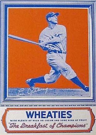
1930s Wheaties Advertisement

Lou Gehrig of the New York Yankees, first to appear on a "Wheaties" cereal package, back of box, 1934.


       Wheaties cereal made it's breakthrough by use of sports. In 1927, an advertisement for the cereal made its debut on a billboard at Nicolett Park. One of the players from the home team, the Minneapolis Millers, was credited with creating the still famous slogan "The breakfast of champions". The cereals' company, General Mills, made it's biggest break when they began to hire professional athletes to campaign for Wheaties. In 1934, the first sports figures appeared on a Wheaties box - Lou Gehrig and Jimmie Fox. Though athletes from other sports made cereal box appearances as well, it became apparent that baseball was the company's biggest seller.
     The main color scheme on the Wheaties cereal boxes was, and still is complementary colors of blue and orange. The earlier boxes even dsiplayed the images of the sports stars in a blue posterized style. The figures against the bold, bright orange background of the box made for a very eye-catching and energizing look that would appeal to their intended consumers.

Thursday, February 17, 2011

Nestle Poster - 1920

The posters designs for Wrigley gum during the early 1900s were very simple and to-the-point. They all utilized the complementary colors of red and green against a white background with a tint of red in it. Their main slogan, "The Flavor Lasts", is directly under the brand name and a little bigger than the other catchy words on the poster. The other short, yet informative type includes "Chew it after every meal" and "Sealed tight...Kept right..."

Monday, February 7, 2011

Canon Logo Evolution


The famous camera brand, Canon, originated in Precision Optical Instruments Laboratory which was established in 1933. The cameras that were first developed as a business trial were named Kwanon, who was the Buddhist Goddess of Mercy. The first logo in 1934 consisted of imagery of the goddess. Since the company's main goal was to reach out the whole world, they felt it was necessary to change the company's name to something that would be more globally accepted, Canon. The Canon logo since 1935 has consisted of only typography, with very slight changes in font throughout the years. Still, it is a world wide known company.

Tuesday, February 1, 2011

Pepsi Logo History

     
      The Pepsi logo has undergone several changes since its debut in 1898. It had originally consisted of just the name of the soda company, before it had been trademarked. Once it was trademarked in 1903, the logo began to evolve. Up until 1950, it remained as simple as the first logo, with subtle changes in the font. Walter Mack, the CEO of Pepsi, developed the design of a bottle cap with the Pepsi-Cola name on it. Also on the bottle cap was the first appearance of the “Pepsi Globe” which had been created to support the US war efforts during the second world war. This new logo was a huge hit and became an integral part of all future logos for the company.
      Going into the 1960s, the name on the logo was changed to a more modern and bold font, and it had also been shortened to just “Pepsi”. The purpose of this was to make the Pepsi Globe the main attraction of the logo. Soon, the Pepsi Globe had evolved from a bottle cap to an actual spheric design. From there it had progressed significantly, but had always remained the most important part of Pepsi's marketing campaign. Today the Pepsi logo consists solely of the Pepsi Globe, which has been altered slightly, with no text.